15 Proven Ways to Optimize Your Product Pages & Increase Sales
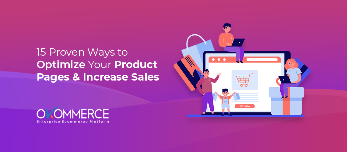
When visitors land on your product page, it means all your hard work and investments are about to pay off. You successfully drove them to the final destination, they’re just one click away from making a buying decision. What if they leave that page without buying? You get nothing, no sales, no conversion. Only a well-optimized product page can guide visitors to the final checkout. That’s why you need to optimize your product pages to generate more sales. How? Keep reading this article. I’ve listed the best strategies to help you.
The success of an ecommerce business lies in its conversion rate. No matter how much traffic you have or how long the session duration is, you can’t make substantial profits without converting your visitors into buyers. Product page optimization can run extra miles for you in this regard.
1. Analyze the Product Pages to Detect Issues

The first step is to pay painstaking attention to the analytics. Figure out what is wrong and what is right with your product page. You can emphasize a few important factors such as page load speed, persuasive content, brand consistency, product suggestions, user-friendly page design, intuitive navigation, and more. When you know the problems, solving them is just a matter of time.
2. Ensure Mobile-Friendly Product Pages

Over 80% of online shoppers use cell phones to make purchases. It’s impossible nowadays to succeed in ecommerce without building mobile responsive websites. If your product pages fail to provide a great experience to mobile users, they’re likely to switch to your competitors who have mobile-friendly designs. So, you have no choice but to create a mobile-friendly website. And it’s even better if you can launch an ecommerce app compatible with different operating systems.
3. Use Professional Quality Photographs

Suppose you’re a customer. Would you buy something from a website that features low-quality photos with no aesthetic value? Of course, anyone with common sense would avoid such stores. As an ecommerce company, it’s your duty to make use of the highest quality pictures to attract customers.
Unlike brick and mortar stores, visitors on ecommerce websites can touch or feel your products. The only way they can understand your products is through images. So, adding photos from multiple angles, providing a 360-degree view, and displaying lifestyle images can help them build a personal connection with the products.
4. Write Precise & Concise Product Descriptions
People are greatly influenced by beautiful product images, yet they look for texts describing the features and specifications of the product. But you have a limited space to say everything about your products. I suggest writing product descriptions that are engaging, precise, and concise. Compress all relevant information and express them in a friendly manner so you can draw buyers’ attention. Don’t write long and uninterrupted paragraphs. Use bullet points, block letters, bold texts, and short paragraphs to make it easier to understand.
5. Use Crystal Clear CTA Buttons

Your aim is to facilitate the decision-making process of your visitors. Use clear and bold call-to-action buttons to implicitly push them to make a purchase. Besides, a buyer needs to know well where he’s clicking. Unclear CTAs leave a poor impression on visitors’ minds. For example, you can use ‘buy now’, ‘add to cart’, ‘click to buy’ etc. obvious CTAs to lead your customers to the buying gateway. Make sure that these buttons are visible, colorful, and easily detectable.
6. Gain Trust with UGC & Reviews

You are likely to spread positive things about your products. That’s very natural, and customers are also aware of that. According to stats. 85% of customers count on online reviews and value them as personal recommendations. Therefore, you need user-generated content (UGC) to gain the trust of potential customers.
Let your buyers speak about your products. Introduce a review section on your product page where verified buyers can share their authentic experiences (hopefully good ones). This will work as social proof, and prospective buyers will feel safe to buy from you. You should also add a Q&A section where visitors can ask and answer questions. A small FAQ section will also increase user engagement.
7. Recommend Relevant Products (Upsell & Cross-Sell)
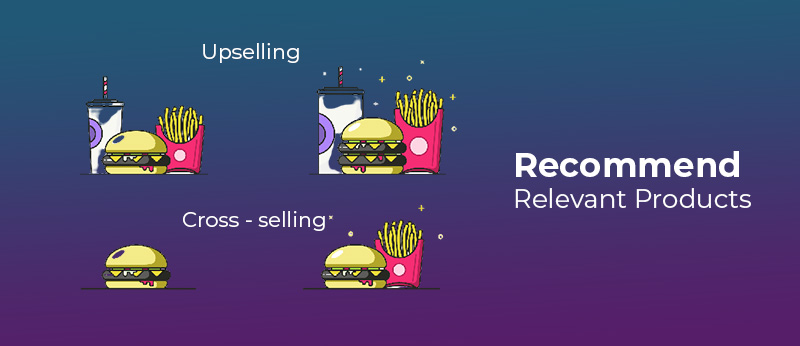
When a visitor searches for a particular product, you’ll readily know what he/she is looking for. And if that person is an existing customer, you’ll get access to his/her purchase history. Analyzing these search queries and purchase histories you can suggest customers buy related products. Equip your sites with competent technology able to recommend personalized products to upsell and cross-sell. Thus, you can induce prospective buyers to purchase something they’re not looking for but they need.
8. Feature Product Videos to Add More Value

A video carries more information than an image. You must use product videos if you sell something that requires a bit of explanation to express its worth. For example, some products are a little complex and buyers need to understand how to use that. In this case, videos play a crucial role. You’ll be surprised to know that 64% of visitors tend to buy an item after watching its video. So, use videos to provide buyers with a closer and detailed look at your products. This will surely add value to your business by generating more sales.
9. Optimize Titles, URLs, & Meta Descriptions
Most people use unnecessary adjectives in product titles. Avoid using generalized titles like “Amazing Stylish T-shirt for Boys”, instead you can say “100% Cotton Slim-fit T-shirt for Boys”. The former one doesn’t contain much product-specific information, but the latter one tells about its material and fittingness. I suggest everyone put keywords and key features in product titles. This will also improve the SEO health of your site.
Choose easy and clutter-free URLs for your product pages. Keep them short and precise so that buyers can understand the type of products simply by looking at the URL. An ideal and SEO friendly URL comprises three things such as brand name, product name, and focus keywords.
The meta description contains a summary of what a page is all about. This is very critical to increasing SEO score. People see the meta titles and descriptions as search results. If the meta title and description of a particular product page look compelling, a user will click on that link for sure. This will increase the number of visitors and generate sales, eventually. That’s why you should write informative and engaging meta descriptions.
10. Optimize Product Page Speed
The standard load time for a website is 3 seconds. If it exceeds this limit, you’re likely to lose 40% of potential buyers instantly. A large number of users leave a website for slow loading issues. Don’t clutter your website with extravagant media elements, HD pictures, and fancy designs that contribute to increasing the load time. Reduce HTTP requests, use of scripts, image sizes, and enable compression to minimize the load speed as much as possible.
11. Include Shipping Details & Return Policy
Different companies adopt different shipping methods. Your customers must know what type of carrier you use, how much the estimated shipping cost is, and how long it will take to reach the customer’s doorsteps. My suggestion is to promote free shipping if possible.
Some buyers also look for return and refund policies on the product pages. Add a brief section describing these terms and policies explicitly so that customers don’t get confused.
12. Choose a Justified Price Point
Don’t think your customers are fools. In this era of the internet, everyone conducts online research before buying a product. So, they have a minimum idea about the prices. Choose a price in keeping with current market conditions. If you can afford to offer lower prices, that’s even better. Make sure that product descriptions, pictures and other visible content of your page add value to your products. All these things will justify the price you’re asking. Don’t let your visitors feel that you’re selling overpriced products.
13. Integrate a Hassle-free Checkout System
This step is very important. Most ecommerce websites ask for a lot of information in the checkout process. I recommend asking for the minimum information required for a secure checkout. You need to keep an option to checkout as a guest along with registered accounts. Make the process as hassle-free as possible. You can add trust labels to build your customers’ confidence to pay without hesitation.
Add several payment options to help people from every locality and region. Visa, Amex, PayPal, Amazon Pay, Master Card, and Google Wallet are a few traditional payment options. Mobile banking wallets are becoming more popular than ever now. Include mobile banking services to attract a broader range of customers. Make multiple payment options available for people from all walks of life.
14. Keep Your Product Pages Up-to-date

Don’t forget a page after optimizing it for once. Your manufacturer may discontinue a product or launch new variants. Keep a close connection with your vendors and adjust necessary changes. Besides, to succeed as an ecommerce company you need to introduce different offers and discounts in celebration of holidays, special days, and festivals. Christmas Day, Thanksgiving, Halloween, New Year, Black Friday, Cyber Monday, etc are such events when you need to come up with special offers. Keep your product pages updated with such offers and remove the event-related elements when it is over. Manage your site efficiently so it looks in line with current trends.
15. Conduct A/B Testing on Everything
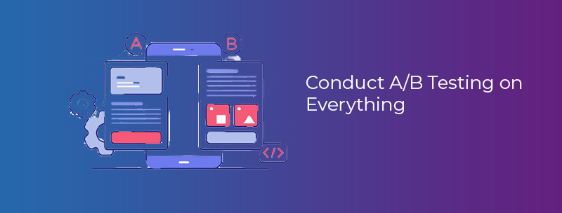
If you get expected results after optimizing your product pages following these suggested techniques, that’s well and good. But if the results are not satisfactory? I’ll suggest you conduct A/B testing, which means giving trials to at least two versions of your product pages. You can tweak CTA wording, change CTA placement and color, improve copywriting, and run other slight changes to see if they work. Keep testing to know which version renders you the best results. Then, finalize a version that can generate more sales than the others.
As an online store owner, you need to read the psychology of your customers. Create a sense of urgency in their mind by instilling fear of missing out. Make them feel that they’re losing a great opportunity by not making a purchase. Add a countdown clock displaying offer deadlines or show them that the stock is almost out. This trick will work, guaranteed. You can also add social media buttons so people can share your products with their friends and peers and seek their suggestions. Make an all-out effort to increase sales, but never go for a hard sell.
To take your ecommerce game to the next level, look no further than Okommerce. It is an enterprise ecommerce platform that is designed specifically for large-scale businesses. Its feature-rich platform can easily cater to the needs of a big ecommerce enterprise effortlessly and efficiently. OKOMMERCE is designed in such a way that it will grow with your business since it's a scalable ecommerce platform.
